Lee Yao

I am a Data Analyst

Lee Yao

I am a data analytics professional with excellent proficiency in coding and statistical programs such as EXCEL, SQL, Qlik Sense, Python, R, and Power BI. I also consider myself an active team player, Python-lover and Problem-solver. I have a huge passion for numbers, charts, and coding. I would love to use my skills to help organizations and myself grow within the role.

  • Katy, Greater Houston, Texas.
  • +1 347 749 3598
  • LeeYao.us@gmail.com
Me

My Data Analytic Skills

Microsoft Excel: Pivot Table, VLOOKUP, XLOOKUP
Microsoft SQL Server: JOIN, HAVING, CTE, SUBQUERIES
Qlik Sense: Back End and Front End editting, Dashboard building
Python: Numpy, Pandas, Matplotlib, Seaborn, Plotly
R/R-studio: tidyverse, ggplot2, readr, skimr, janitor
Microsoft Power BI: Power Query, Dashboard building

Microsoft Excel 70%
MySQL 55%
Qlik Sense 60%
Python 50%
Power BI 65%
R/R-Studio 25%
  • Cyclistic Share Bike Capstone R Project

    Cyclistic Share Bike Capstone R Project

    How Does a Bike-Share Navigate Speedy Success?


    Ask Questions:

    1.       How do annual members and casual riders use Cyclistic bikes differently?

    2.       Why would casual riders buy Cyclistic annual memberships?

    3.       How can Cyclistic use digital media to influence casual riders to become members? 

    As a junior data analyst, I have been assigned to answer the first question: How do annual members and casual riders use Cyclistic bikes differently? 

    Key stakeholders:

    1.       Lily Moreno: The director of marketing and my manager.

    2.       Cyclistic executive team: The notoriously detail-oriented executive team will decide whether to approve the recommended marketing program. 

    Prepare:

    1.       Download the previous 12 months of Cyclistic trip data from the website called “divvy-tripdata”. The datasets are appropriate and organized. These data are reliable, original, comprehensive, current and cited. The data has been made available by motivate international Inc. under this license. By analyzing these data, I would be to find the connection between casual and member riders to identify the trends. 

    2.       Sorting and filtering the data: There are some NULL cells in the tables and needs to be marked as N/A which will not be used in the data analysis.  Also, I removed the blank cells by using filtering.

     Process:

    R-Studio: 

    GitHub code

    # Install all the packages
    
    install.packages("tidyverse")
    install.packages("lubridate")
    install.packages("skimr")
    
    library(tidyverse)
    library(lubridate)
    library(ggplot2)
    library(dplyr)
    library(skimr)

    Sep21 <- read.csv("202109-divvy-tripdata.csv") 
    Oct21 <- read.csv("202110-divvy-tripdata.csv") 
    Nov21 <- read.csv("202111-divvy-tripdata.csv") 
    Dec21 <- read.csv("202112-divvy-tripdata.csv") 
    Jan22 <- read.csv("202201-divvy-tripdata.csv") 
    Feb22 <- read.csv("202202-divvy-tripdata.csv") 
    Mar22 <- read.csv("202203-divvy-tripdata.csv") 
    Apr22 <- read.csv("202204-divvy-tripdata.csv") 
    May22 <- read.csv("202205-divvy-tripdata.csv") 
    Jun22 <- read.csv("202206-divvy-tripdata.csv") 
    Jul22 <- read.csv("202207-divvy-tripdata.csv") 
    Aug22 <- read.csv("202208-divvy-tripdata.csv")

    # Combine all files into one file called "totaltripdata"
    
    totaltripdata <- rbind(Sep21,Oct21,Nov21,Dec21,Jan22,Feb22,Mar22,Apr22,May22,Jun22,Jul22,Aug22)
    nrow(totaltripdata) # number of rows
    [1] 5883043
    
    ncol(totaltripdata) # number of columns
    [1] 13
    
    head(totaltripdata) # check the first 6 rows of the data frame
    tail(totaltripdata) # check the last 6 rows of the data frame
    summary(totaltripdata) # statistical summary of the data 
    colnames(totaltripdata) # list of column names
    
    [1] "ride_id"            "rideable_type"      "started_at"         "ended_at"           "start_station_name"
    [6] "start_station_id"   "end_station_name"   "end_station_id"     "start_lat"          "start_lng"         
    [11] "end_lat"            "end_lng"            "member_casual"  

    sum(is.na(totaltripdata)) # check how many rows are NA
    [1] 11454
    
    totaltripdata <- na.omit(totaltripdata) # Drop all NA rows
    
    summary(totaltripdata) # Check the summary of data
    
    dim(totaltripdata) # dimension of the dataset
    
    colnames(totaltripdata) # check column name of the dataset
    
    str(totaltripdata) # Check the column data type 
    
    summary(totaltripdata) # Check the summary of the dataset
    
    skim(totaltripdata) # Check the summary of the data, see if any data missing

    #totaltripdata$date <- as.Date(totaltripdata$started_at)
    totaltripdata$month <- format(as.Date(totaltripdata$date), "%m")
    totaltripdata$day <- format(as.Date(totaltripdata$date), "%d")
    totaltripdata$year <- format(as.Date(totaltripdata$date), "%y")
    totaltripdata$day_of_week <- format(as.Date(totaltripdata$date), "%w")
    
    # Calculate the time difference between ended_at and started_at, add a new column called ride_length
    totaltripdata$ride_length <- difftime(totaltripdata$ended_at, totaltripdata$started_at)
    
    is.factor(totaltripdata$ride_length)
    [1] FALSE
    
    totaltripdata$ride_length <- as.numeric(as.character(totaltripdata$ride_length))
    
    is.numeric(totaltripdata$ride_length)
    [1] TRUE
    
    skim(totaltripdata$ride_length)
    
    # Set up a new dataset called "totaltripdata_2" including the ride_length greater than 0
    totaltripdata_2 <- totaltripdata[!(totaltripdata$ride_length<0),] 
    
    sskim(totaltripdata_2)

    # Aggregate the totaltripdata_2
    aggregate(totaltripdata_2$ride_length ~ totaltripdata_2$member_casual, FUN = mean)
    
      totaltripdata_2$member_casual totaltripdata_2$ride_length
    1                        casual                   1758.0228
    2                        member                    771.3398
    
    aggregate(totaltripdata_2$ride_length ~ totaltripdata_2$member_casual, FUN = median)
    
      totaltripdata_2$member_casual totaltripdata_2$ride_length
    1                        casual                         835
    2                        member                         538
    
    aggregate(totaltripdata_2$ride_length ~ totaltripdata_2$member_casual, FUN = max)
     
      totaltripdata_2$member_casual totaltripdata_2$ride_length
    1                        casual                     2442301
    2                        member                       89998
    
    aggregate(totaltripdata_2$ride_length ~ totaltripdata_2$member_casual, FUN = min)
    
      totaltripdata_2$member_casual totaltripdata_2$ride_length
    1                        casual                           0
    2                        member                           0

    # Order the days of the week, set Sunday as the first day of the week 
    totaltripdata_2$day_of_week <- ordered(totaltripdata_2$day_of_week, levels=c("Sunday","Monday","Tuesday","Wednesday","Thursday","Friday","Saturday"))

    # Plot the numnber_of_rides vs. day of week
    totaltripdata_2 %>% 
      mutate(weekday = wday(started_at, label = TRUE)) %>% 
      group_by(member_casual, weekday) %>% 
      summarise(number_of_rides = n(), average_duration = mean(ride_length)) %>% 
      arrange(member_casual, weekday) %>% 
      ggplot(aes(x = weekday, y = number_of_rides, fill = member_casual)) + geom_col(position = "dodge")


    # Plot the average duration of rides vs. day of week
    totaltripdata_2 %>% 
      mutate(weekday = wday(started_at, label = TRUE)) %>% 
      group_by(member_casual, weekday) %>% 
      summarise(number_of_rides = n(), average_duration = mean(ride_length)) %>%
      arrange(member_casual, weekday)  %>% 
      ggplot(aes(x = weekday, y = average_duration, fill = member_casual)) + geom_col(position = 'dodge')


    # Export the analyzed file into the work drive
    write.csv(totaltripdata_2, "data.csv")

    Power BI Dashboard: 


    Conclusion: 

        1. During weekdays, member riders tend to ride bikes more often than casual riders because they are mainly using bikes for the home-work commutes. Casual riders ride bikes more than member riders during weekends because they have more available time to ride for leisure. 

        2. Casual riders ride bikes much longer than casual riders because they have a relatively steady start point and destination point (e.g. home and workplace). 


  • USA Airport Database Power BI Dashboard Project

    USA Airport Database Power BI Dashboard Project


    USA Airport Database Power BI Dashboard Project 

               To check the detail of this dashboard, please click here


  • US Real Estate Data Python Project

    US Real Estate Data Python Project


    US Real Estate Data Project

    About the Dataset

    This dataset contains Real Estate listings in the US broken by State and zip code. Data was collected via web scraping using python libraries by the author - Ahmed Shahriar Sakib. 

    The data set was updated one month ago. 

    Content 

    The data set has 1 CSV file with 12 columns: status, price, bed, bath, acre_lot, full_address, street, city, state, zip_code, house_size, and sold_date

    Acknowledgments

    Data was scraped from www.realtor.com, A real estate listing website operated by the News Corp subsidiary Move, Inc. and based in Santa Clara, California. It is the second most visited real estate listing website in the United States as of 2021, with over 100 million monthly active users. 

    Questions we can ask before planning this project: 

    Can we predict housing prices based on this data? 

    Which location contains the house with the highest prices? 

    What is the correlation between house prices and other attributes? 

    What could be the trend behind housing prices? 


    Project: 

    Step 1. Import all the packages. 


    Step 2. Imports the .csv file from the Kaggle page 


    Or, download the .csv file and then upload to Python from local drive


    Step 3. Check the information and columns of the data 


    Step 4. Sort and filter the data, dropped any duplicated, Null, or NA rows, and changed the unwanted data type into the one I need. For detailed coding, please check here

    Step 5. Analysis 

    Find the relationship between the number of listings and states in the US 


    Find the trends of prices along with the year: 


    Find the relationship between Price and the number of bedrooms


    Find the relationship between Price and states in the US: 


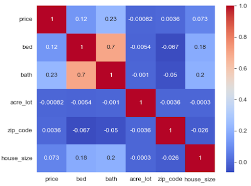
    Find the correlations between price and other factor of the data: 


    For detailed coding and visualization, please check my GitHub portfolio page by clicking here

    Conclusion
        
                1. House prices fluctuated from 1980 to 2020, and the entire trend is going upward. 

                2. House prices are determined by many factors, such as the number of bedrooms and house size. 
                3. New York is still the top real estate market in the United States. New Jersey, Connecticut, and Massachusetts have shown higher growth than the other states. 


    Thank you for watching my project. Your feedback and comments are appreciated. 


  • Stock Price of Top USA Banks Data Analytics Python Project

    Stock Price of Top USA Banks Data Analytics Python Project


    Stock Price of Top USA Banks Finance Data Project 


    In this project, I used Numpy, Pandas, Seaborn, Matplotlib, Pandas_datareader  and Datetime to collect stock price data from Yahoo Finance, analyzed the data and obtain the visualization between the price and datetime of banks. Since the data was collected from Yahoo Finance, it is reliable and authenticated. However, the purpose of this project is only for study and analytics purpose, not for the realistic stock purchase purpose. The date of stock price data collected was from 1/1/2006 to 12/31/2016. 

    The imports: 


    Import the finance data from Yahoo Finance


    Create the column names and concatenate these banks stock price tables 


    I used .xs function to find out the maximum close price for each bank's stock throughout the entire 2006 - 2016 period. 


    I used pct_change() function to create the new columns to show the return value of each bank's


    Imports Seaborn and made a pairplot


    Calculate the standard deviation of the returns for each bank's stock and made the plots


    Plot 2008 returns for CitiGroup in 2008 only 


    Imports plotply and cufflinks 


    Plot all stocks for all banks during 2006 - 2016


    Plot a heatmap of the correlation between the stocks close price 


    Plot a clustermap for the correlations of close price


    Candle plot of Bank of America's stock from 1/1/2015 to 1/1/2016 


    This is the display for part of my project, including coding and visualization. If you would like to see the full picture of my project, please click here Bank Stock Python Project

    Thank you for watching, and I would really appreciate your feedback and comment. 


  • Search This Blog

    Powered by Blogger.

    Blog Archive

    LOCATION

    Katy, Greater Houston, Texas

    EMAIL

    LeeYao.us@gmail.com

    TELEPHONE

    NONE

    MOBILE

    +1 347-749-3598